


Below are examples of the former email templates within several different marketing categories demonstrating the lack of a cohesive visual identity and structure

The new system had tremendous success in both establishing a consistent visual identity and in streamlining internal processes, while remaining flexible and fresh.
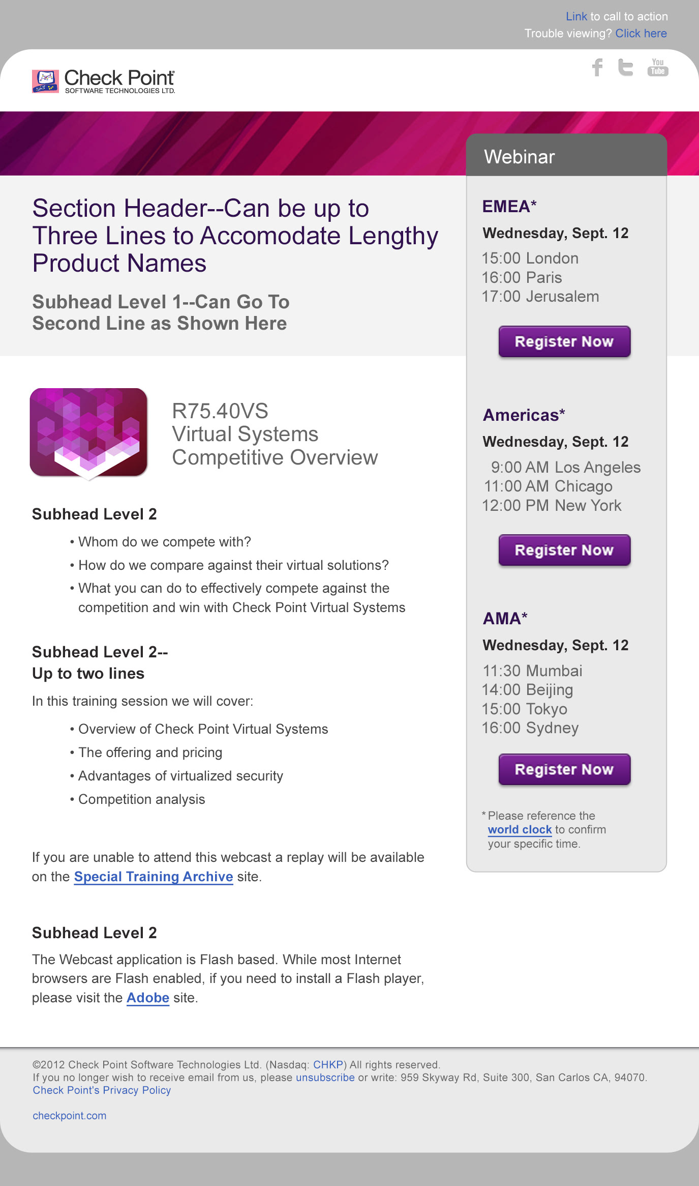
Basic new template, flexibly editable in Omniture using customizable header banners, font sizes, and palettes
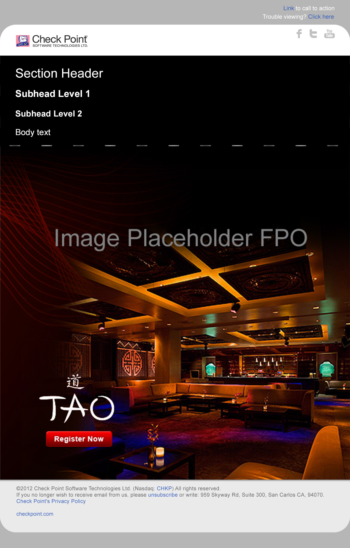
Alternate template layout option when a "full-page" graphic effect is desired. The area above the "fold" is editable html, so text will remain visible if images aren't downloaded by the receiver. It is seamlessly integrated with the graphic portion at the bottom to give the illusion of being one continuous image.

One of a series of five "To the Point" e-newsletter templates used by the field marketing team with customized banners and palettes.

The entire series of "To the Point" e-newsletter templates as described in the Email Template User Guide, showing pre-defined banner, palette, and button graphic options.
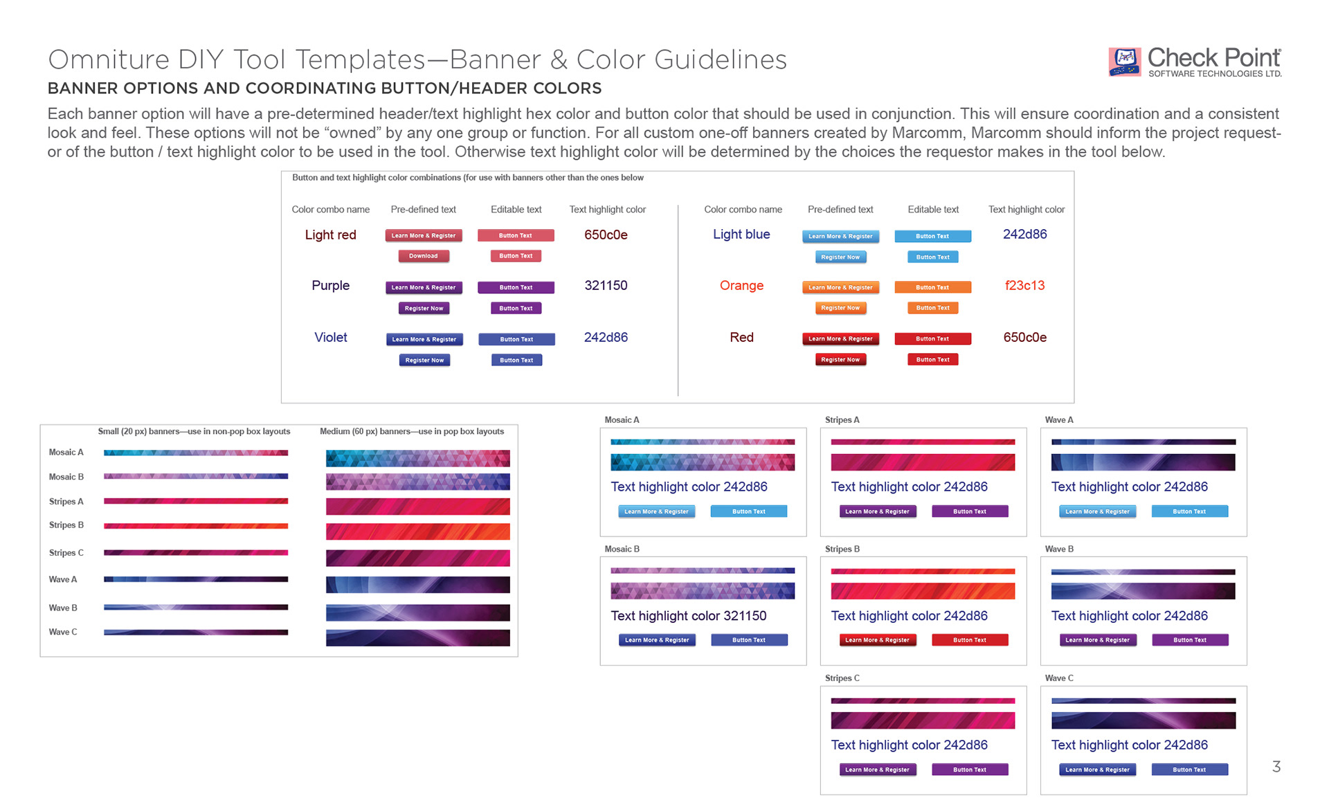
The various banner choices and coordinating button colors available in the Omniture template tool, as shown in the Email Template User Guide. These are flexible and can easily be swapped out for new choices as Check Point's visual identity becomes more defined.
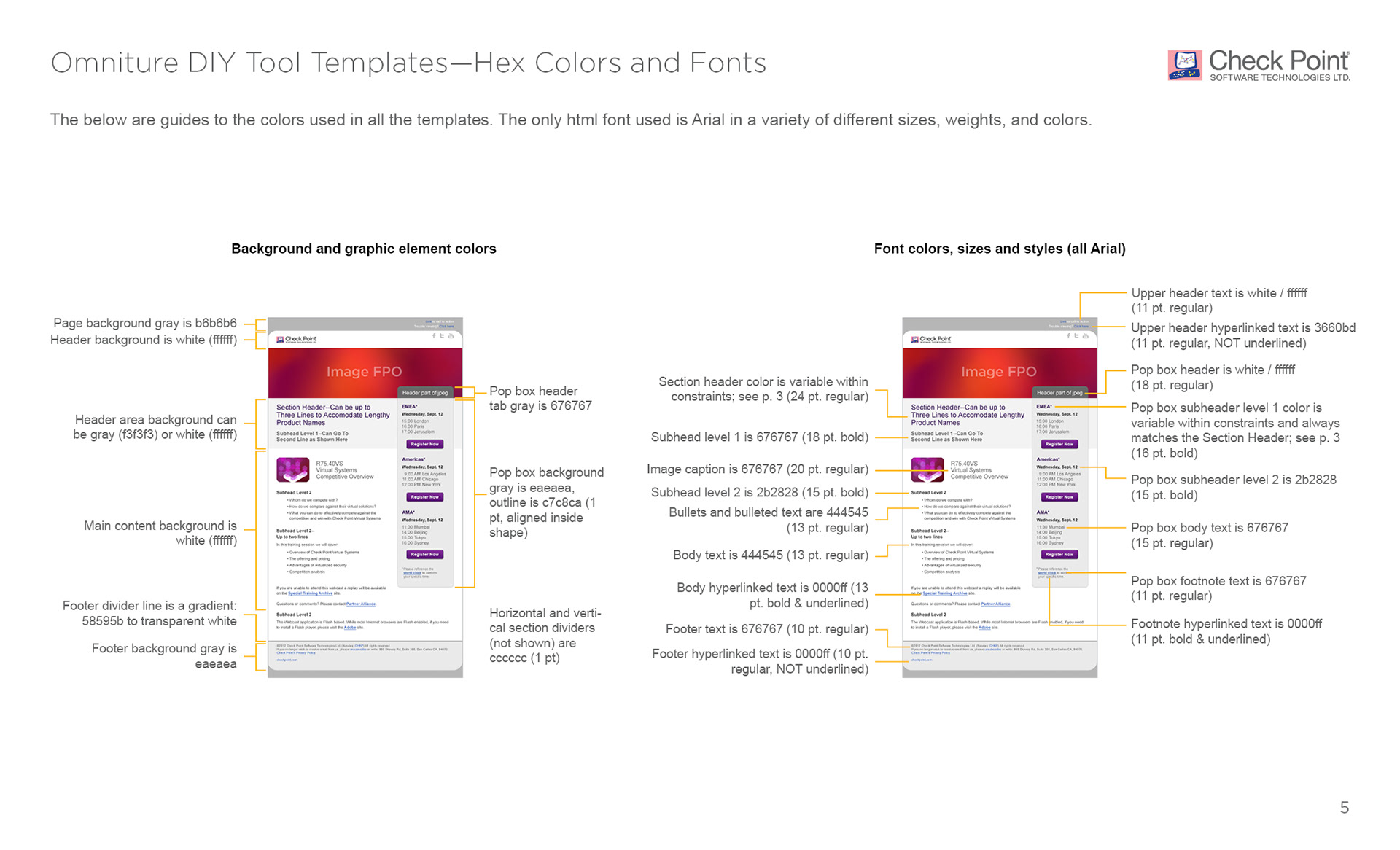
The palette color guide to assist Web Development in the coding of the html templates, as well as the designers creating new graphic content for new emails.
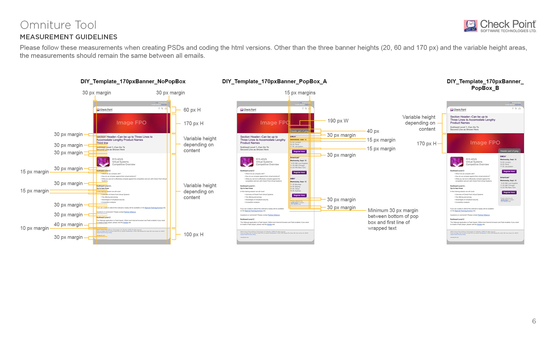
The pixel measurement guides to assist Web Development in the coding of html palettes, as well as the designers creating new graphic content for new emails.