

This is the opening sequence of a presentation delivered by Check Point's VP of Information Systems at the Sales Kick Off (internal) and Check Point Experience (external) events in 2013. He and I originally developed it together about 5 years before that, and have worked on every iteration over the years. It has been a very successful presentation for him, creating a lot of buy-in for his vision. End-users, channel partners, executives and employees alike now understand the magnitude of his task in securing Check Point's complex network systems, something which he achieves with a very small workforce due to the powerful management capabilities of Check Point's products. These graphics were significantly updated from the previous years' version to reflect updated branding and palette. The animations involved are complex on the back end, but they appear seamless and smooth to the viewer. I custom illustrated the majority of the app icons.
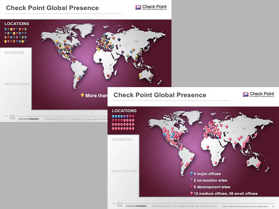
This slide builds so that the multi-colored pins change color corresponding to one of four types of location.

In this slide, the figures change color and organize into columns representing where they access Check Point Internet gateways.
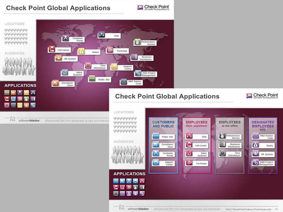
This slide builds similarly to the last, in that the variously colored application icons change color and organize into columns based upon what types of people access them.
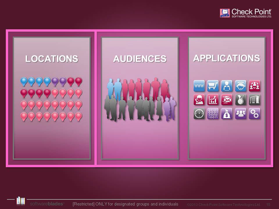
Lastly, the three main categories introduced in the above slides are reinforced in this summary slide, which also serves as the structural overview for the remainder of the presentation